In last week’s note on stock market sentiment, we laid out a bullish case over the next 6 months, and simultaneously cautioned against possible mini-shakeouts in the short term designed to take out the late money – that has just joined the party off of the August lows (in recent days/weeks).
This week we will discuss the Katy Perry “Hot N Cold” Stock Market – as defined by her memorable lyrics:
‘Cause you’re hot then you’re cold
You’re yes then you’re no
You’re in then you’re out
You’re up then you’re down
Listen to Katy Perry’s Hot n Cold Here
We may get a mini-shakeout at some point in the short-term, but as we will lay out – the “overbought” conditions can be worked off relatively soon (either in price/pullback or time/sideways grind for a bit). The key to keep in mind is that most institutions are playing catch up and will still have to plow into equities before year-end to catch their benchmark, keep their jobs, and earn a bonus.
Further to the forced institutional flows which will be called into the equity markets “kicking and screaming” in coming weeks, you have the highest amount of cash in Money Market funds in more than a decade.
Assets in money-market funds have grown by $1 trillion over the last three years to their highest level in around a decade, according to Lipper data. There is a key line in the article below defining retail sentiment, “investors haven’t grown excessively exuberant despite markets’ double-digit gains this year, and have plenty of money available to buy when lower prices prevail.”
WSJ: Ready to Boost Stocks: Investors’ Multitrillion Cash Hoard
The old trading axiom may apply, “when everyone’s looking for a pullback to buy, you might not get it.” Or more simply put – the “pain trade” is up (particularly after the late money gets a little scare).
Another point of concern noted in the Wall Street Journal article was concern that the expansion has gone on too long (10 years) – which we addressed in our note this July:
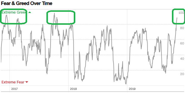
Short term indicators are overbought (as we mentioned last week with the CNN Fear & Greed Index). In the context of a “melt-up” scenario – which we posited in our September 5th article below (when most managers were overweight bonds and cash), these indicators can stay pinned for many weeks (or they can take a breather before resuming the move up).
AAII Sentiment Survey Results: Pessimism Strong, Opportunity Stronger…
We will see, but a good context for this would be late 2017 when every indicator stayed pinned for 2+ months straight. Given the amount of retail and institutional cash that is still on the sidelines, this concept of “pinning” at overbought is a reasonable possibility into year-end.
So while many of the technical analysts are correct in their assessment of the indicators pointing to a reversal/correction/crash, there are structural factors/positioning/seasonality that may overwhelm the normal tendency to “revert to the mean” (in the short term).
Pinning is a real possibility now and becomes more likely because of the amount of people it would catch offsides. Unfortunately, that’s the way the market works. It likes to catch the most amount of people on the wrong side of the boat as possible.
Let me give you an example of one of the breadth indicators I look at called the Nasdaq McCellan Summation Index. It is a running total of the McClellan Oscillator values. The McClellan Oscillator is calculated by subtracting the 39-day exponential moving average of Net Advances from the 19-day exponential moving average of Net Advances.
If you look in the short term, you will come to the same conclusion that you are hearing from many technical analysts in the last few days, “the market is overbought:”
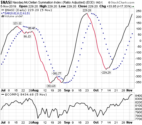
If you look at the Summation Index on the top relative to the Nasdaq Composite Index at the bottom, you would say, “looks like it’s getting to the levels that the market reversed the last two times” – and that might be correct. HOWEVER, what happens when you step back a few feet and see where we are over time?
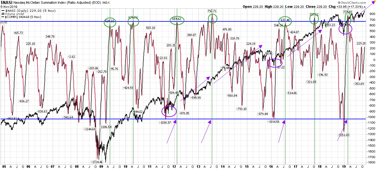
This covers 14 years of the Nasdaq McCellan Summation Index ($NASI) relative to the Nasdaq Composite (in black). Let me walk you through the annotations…
The first thing you will see is that is has run in a wide range over the past 14 years (from ~-1000 to +700). It is currently at +229. All of the green circles at the top were when the $NASI hit the top of the range. I have drawn green vertical lines so you can see how the extreme in the $NASI correlated with the price action in the Nasdaq Composite.
What is notable is that when this breadth measure hit the “extreme” in 5 of 7 instances, the Nasdaq continued to rally for many months.
Next, I circled the 3 big drawdowns in purple 2011, 2016, and 2018. The purple arrow notes the first moves of the $NASI to the high of the range AFTER the market came out of its correction.
-In 2012, the market rallied another ~18 months after the 1st “extreme read” coming out of the 2011 correction.
-In 2016, the market rallied another ~15 months after the 1st “extreme read” coming out of the 2016 correction.
-In 2018, the market has gone up for just 8 months since the first “extreme read” coming out of the 2018 correction. If we were to roll over at this stage, it would be the exception coming out of the steep correction in late 2018 to “end” the market strength in less than a year.
Same indicator – two viewpoints. One gets you out now, one keeps you in for the second half of the rally. So if we get any “mini-shakeout” to get the weak sisters out of the market, as we discussed in last week’s VideoCast, it would be just that – very short term (voting machine vs. weighing machine concept).
Part of the drove of correction talk is attributable to the recency bias of last year – when the stock market bucked the seasonal trend – by crashing in the 4th quarter versus the long term seasonal tendency to rise from late October to year-end.
Keep in mind the conditions were different:
1) 2019 Earnings Expectations were low.
2) The Fed was on a tightening tear – sucking $50B of liquidity out of the market each month with quantitative tightening and raising rates another 2x in Q4 into slowing growth.
Whereas now:
1) 2020 EPS estimates for both the US and Europe are ~double digit growth for the first time since 2016 going into 2017.
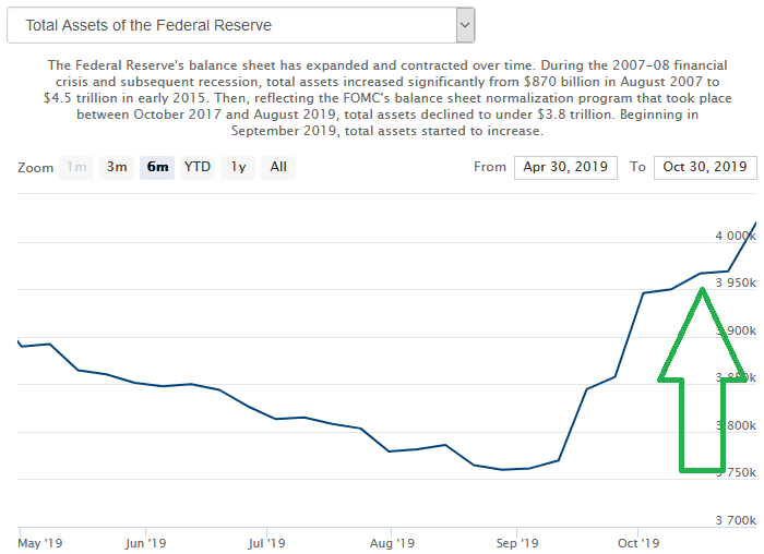
2) The Fed, ECB and BoJ are all back to loose monetary policy. Fed has cut 3x into RISING growth and added ~$270 Billion of liquidity in 9 weeks, ECB is back at QE ($20B/mo), and BoJ never stopped!
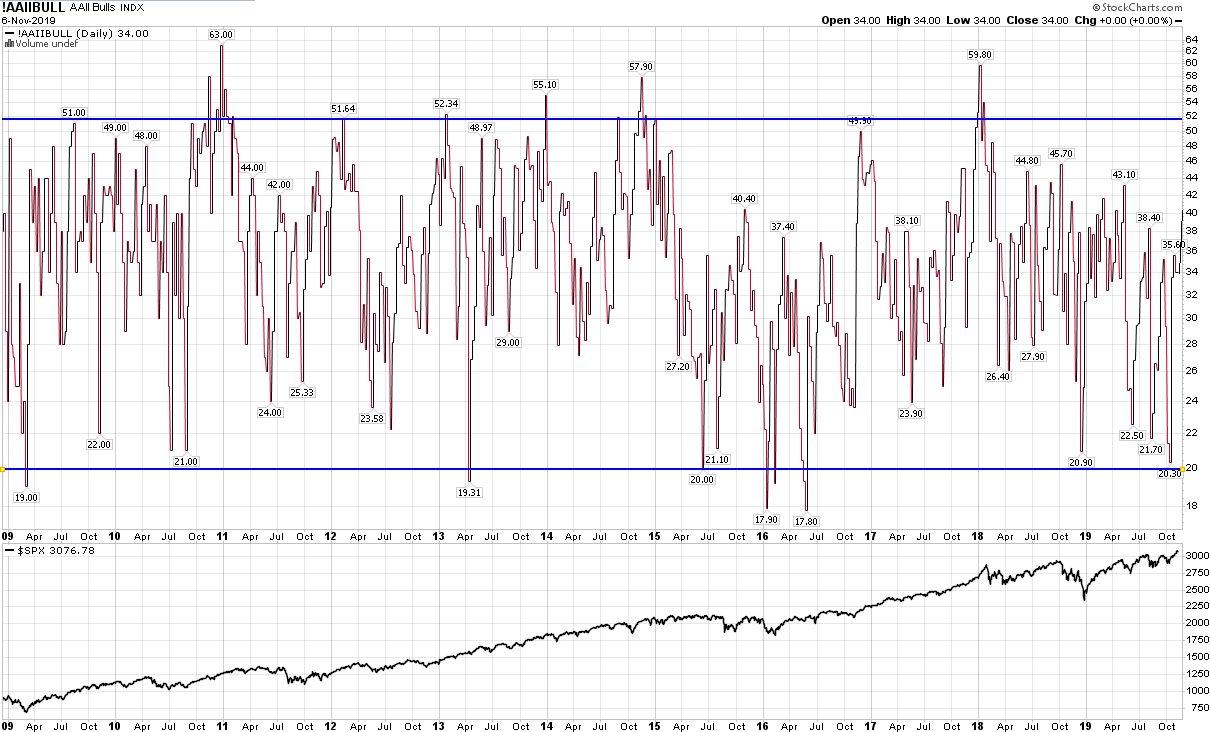
This week’s AAII Sentiment Survey result (Video Explanation) came in at 40.30%, up from 33.98% last week. Bearish Percent fell to 23.93% from 28.43% last week. In the short term it looks like maybe people are getting too bullish.
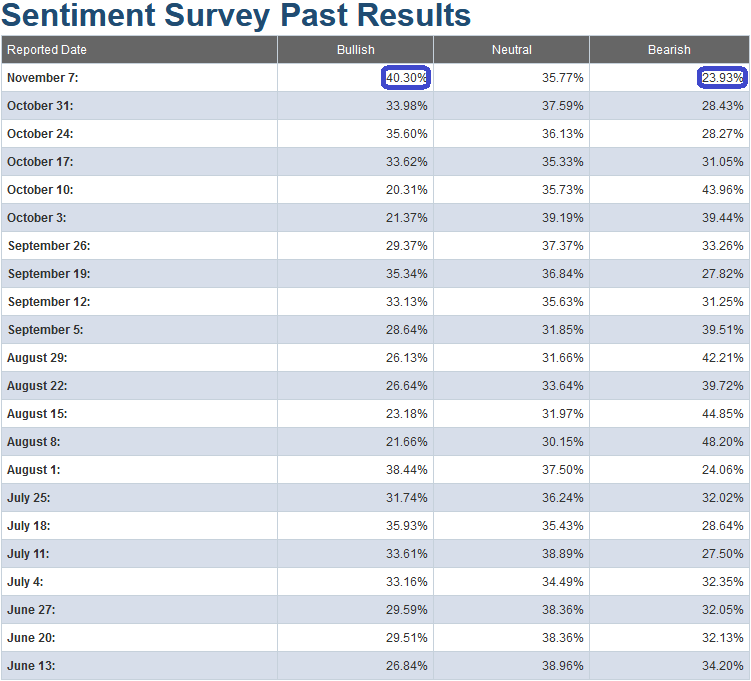
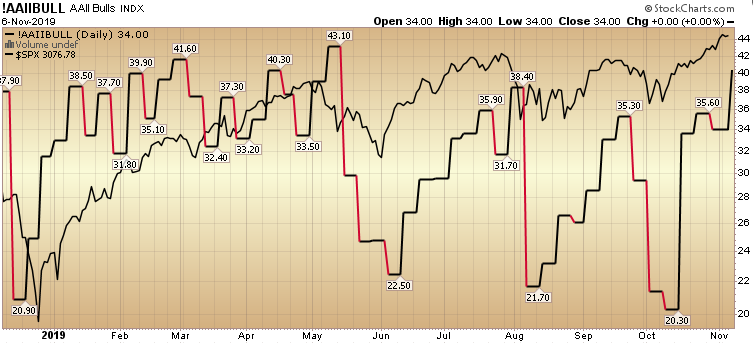
But again, if you step back and look over the long term, the range has been 20-50 and multiple times it got well above 50 – and the market kept rising…
Here’s another example of indicators getting pinned. This week the NAAIM (National Association of Active Investment Managers Index) jumped from 65% to 88.94% Equity exposure. If we look at a shorter term chart we would say, okay everyone is in now, time to go short. But when you zoom out and look at a longer term perspective you can see that it can get pinned above 85-100% for months or years at a time (2013-2015 and 2016-2018).
The blue vertical lines mark every time active managers have gotten above 85% equity exposure. On the bottom, the green and red arrows mark what happened each time the indicator got “overbought.” In most instances, the market kept going higher AFTER the first “overbought” signal. And in the 2 instances I pointed out above, it stayed pinned for 2 years at a time. Here is the chart with my annotations:
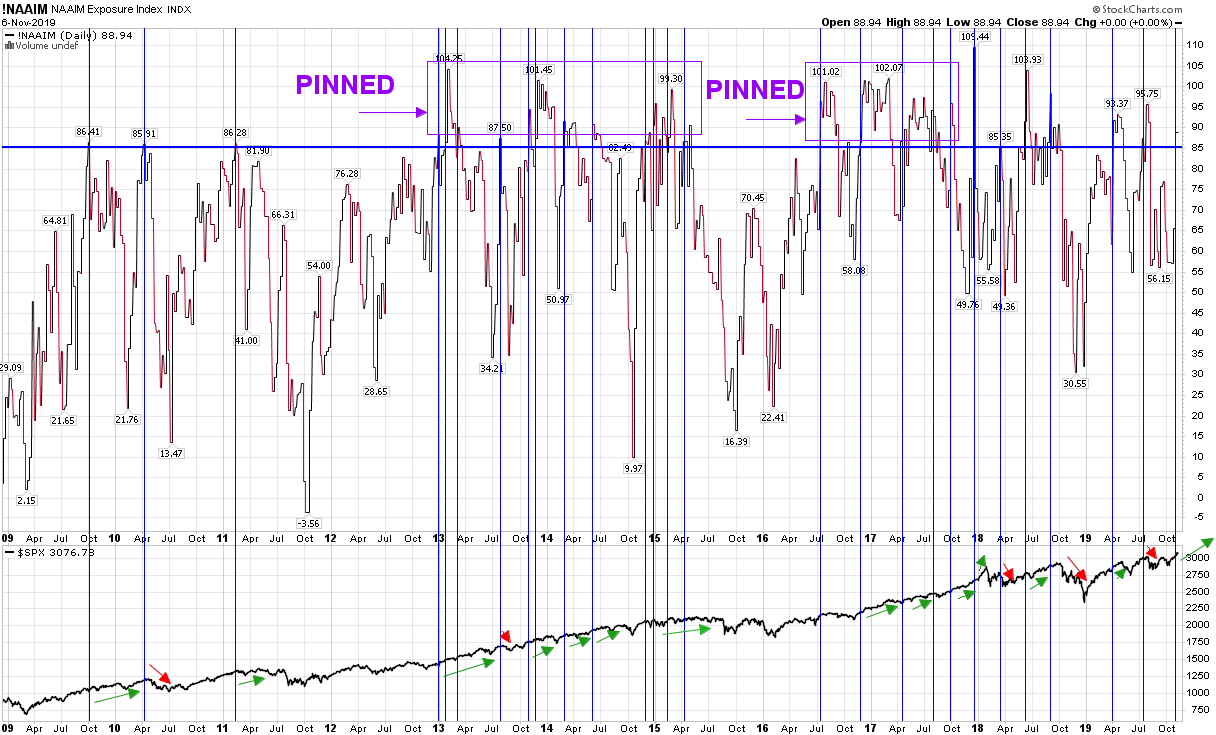
You can also see where the highest probability of “PINNING” (purple rectangles at the top) comes – and that is after coming out of ~20% corrections like 2011, 2016 and 2018 (we’ll see if it “PINS” above 85 in coming months).
On a shorter term basis/outlook, the CNN Fear and Greed Index jumped another 13 points to a caution zone at 88%.
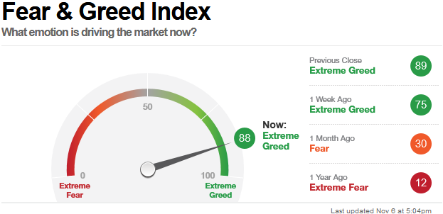
This is not the point that you want to begin initiating a lot of new long positions. As we mentioned last week, you may be trimming portions of stocks that have had huge gains – or if initiating new risk – doing so only in those sectors/companies that money is just beginning to rotate into.
However, just because this short term indicator is in the caution zone does not mean it can’t get “pinned” as well – just as it did in Q4 2016 – Q1 2017, and again in Q4 2017-Q1 2018. The market rose and rose and rose…
Two sectors that were down and out – that we suggested in September and October respectively – were Biotech and Exploration and Production (Energy sub-sector).
Biotech has already had a ~15% move in 5 weeks. The exploration and production sector is just starting to move with a ~7% move in the last few weeks. You can see the articles here:
Snake OIL? How Portfolio Managers View Exploration & Production Stocks…
So the theme for this week’s market is that while the short term indicators may be “overbought”, do not underestimate the ability of them to stay overbought for some time – due to seasonal timing and institutional positioning.
We may see the very short term Katy Perry “Hot N Cold” (up and down) Stock Market, but my suggestion is to take a step back and look out 6-9 months. Odds are on the side of constructive outcomes given forward earnings estimates, central bank liquidity, multiple expansion, and troughing economic numbers globally.
Leave the ups and downs to Katy…